

A Thumb on the Scale
How even good vaccine safety studies can be misused against vaccines


Our World in Data published a new article on April 21, 2025 on the safety and efficacy of the measles vaccine. The overall theme of the post is that the measles vaccine is very safe and highly effective at preventing measles infection. The data come from a meta-analysis from the Cochrane Library of Systematic Reviews, a highly respected database of carefully crafted reviews that combine data from multiple studies to reach more refined conclusions on biomedical questions.
These data are represented in a graphical display known as a forest plot. The vertical gray line indicates a risk ratio (or odds ratio or rate ratio, depending on the study type) of 1, indicating that the outcome (listed on the left side of the plot) has equal risk in both the vaccinated and unvaccinated groups. The closed circle/dot for each outcome represents the average risk ratio and the horizontal colored lines extending out from both sides of the circle (sometimes called “whisker” lines) represent the 95 percent confidence interval, which indicates that we can be 95 percent confident that the true risk falls somewhere within the range covered by the whisker lines.
To walk you through an example, the third outcome listed examines the effectiveness of the measles vaccine at preventing measles infection when given as a single dose to someone (previously unvaccinated) who has just been exposed to a person with measles ( a use of the vaccine known as post-exposure prophylaxis, or PEP). You can see that a single dose of vaccine reduces risk by about 6-fold on average, but that the true risk decrease could fall in the wider range of 0.5-fold to 25-fold. The whisker lines don’t cross the gray bar, so the conclusion is that a measles vaccine given after a measles exposure significantly reduces the risk of measles infection. If the whisker lines cross the gray vertical line (like they do for ulcerative colitis or multiple sclerosis), the appropriate conclusion is that the vaccine doesn’t alter the risk of that outcome.
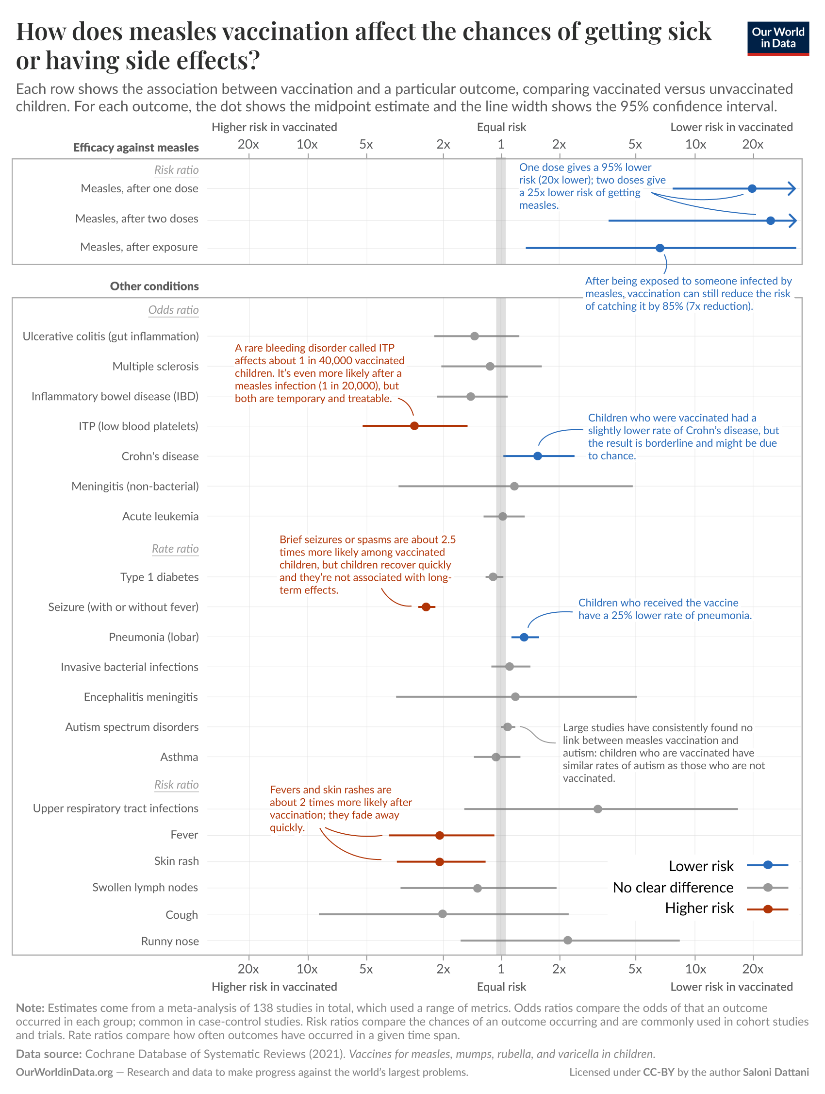
I’ll state upfront that I love Our World in Data and this particular article is well-written and presents a graphical representation that is faithful to the data in the Cochrane Review. I particularly like the top section of the display, which accurately shows how effective the measles vaccine is at preventing measles.
But I’m a little less sanguine on the bottom half of the display, principally because at a casual glance it seems to suggest that the measles vaccine increases the risk of certain conditions, such as idiopathic thrombocytopenic purpura (ITP, an autoimmune bleeding disorder affecting platelets) and febrile seizures. I’ve certainly seen anti-vaccine activists citing these data (or similar data from other studies) to support this point, sometimes while wearing t-shirts that say things like “Vaccines Cause Seizures.” The bars are red (higher risk in the vaccinated group) and the whisker lines don’t cross the gray line, so isn’t the appropriate conclusion that the measles vaccine increases the risk of these conditions?
Part of the answer is suggested by the comment shown next to the ITP data. It says that the risk of ITP is 1 in 40,000 in those receiving the measles vaccine, but the risk of ITP is 1 in 20,000 in those who get measles (which the measles vaccine is 95% effective at preventing). So, although it’s not reflected in the graph itself, it sounds a whole lot like the measles vaccine actually cuts the incidence of measles-related ITP in half. It sounds that way because that’s what it does.
So why does the graph make it look like the vaccine increases the risk of ITP? Because systemic reviews and meta-analyses (studies the combine and merge data from many other studies) can’t eliminate the intrinsic weaknesses of the studies that they are combining. The studies being combined by this meta-analysis were conducted mostly after 1980, after measles had been virtually (albeit temporarily) eliminated from the US by widespread vaccination, meaning that the comparison group (essentially the background population rate of each outcome) was comprised entirely of people who didn’t have measles. The data show that a child who receives the measles vaccine has a 1 in 40,000 chance of getting ITP, which truly is about 3 times more likely than the 1 in 120,000 chance that an unvaccinated child has if that child is lucky enough to not get measles—but it’s also 2-fold lower risk than the 1 in 20,000 chance of ITP in a child who gets measles. In the pre-vaccine era, all children got measles. If you know even a little bit about measles, the real conclusion that can be drawn from these data is that the measles vaccine significantly reduces the risk of ITP—it just doesn't reduce that risk all the way to “zero” (i.e., the background rate in a measles-free population).
The same analysis holds for seizures. Febrile seizures are brief seizures that are associated with fever and can be seen with pretty much any condition that can cause a child to have a fever. The measles vaccine (as with many vaccines) can cause a fever in some recipients. Measles virus, on the other hand, causes fever in virtually all of those it infects. The plot suggests that the vaccine increases the rate of seizures by 2.5-fold, but that’s only in comparison to the background rate without measles infection. The rate of febrile seizures attributable to the measles vaccine is 1.5 - 3.3 cases per 1,000 vaccine recipients. The rate of febrile seizures attributable to measles infection is at least this high, with some studies quoting a rate as high as 23 cases per 1,000 measles infections. In other words, by preventing measles, the measles vaccine almost certainly reduces the incidence of febrile seizures—again, just not all the way to “zero.” (It’s also worth noting that febrile seizures after vaccines aren’t associated with increased risk of later seizure disorders or developmental problems.)
The general point I’m making is that vaccine safety studies that compare post-vaccine outcomes to background population rates can often, by their very design, create a bias against the vaccine. This should be most obvious when you examine the two lowest red risk lines in the display, corresponding to fever and rash. The display suggests fever and rash are 2-fold more common in the measles vaccine group. Yet the measles vaccine prevents a disease that causes fever and rash in all cases—the measles vaccine clearly reduces the overall risk of fever and skin rash if you account for the fact that unvaccinated people can get measles (and pretty much always do in an entirely unvaccinated society).
I want to end by again clarifying that I am not critical of the data or data like these. We definitely want to have this type of data to help inform guidance on vaccine recommendations. But using these types of studies as the sole basis for analyzing vaccine safety puts a thumb on the scale in favor of not vaccinating—a thumb that even a bright, well-educated layperson is unlikely to notice. It’s important to understand that these data can be easily misinterpreted, especially in the context of the constant refrain of “do your own research” from anti-vaccine activists. This is part of why I think “doing your own research” (i.e., your own critical review of complex biomedical literature without comment or explanation from experts) is usually not a good idea. This type of pursuit is too likely to result in the wrong conclusions.